
It has been two years since we took a deep dive into my investment portfolio. A few things have changed over the last two years—even though my portfolio’s overall allocation is more or less the same. I have discussed bits and pieces of these changes in past blog posts. Just hadn’t gotten around to reviewing the entire portfolio. Until now, that is. For context, please review my blog post from November 2017—A deeper look into my portfolio.
Without further ado, here’s how my portfolio looks today:
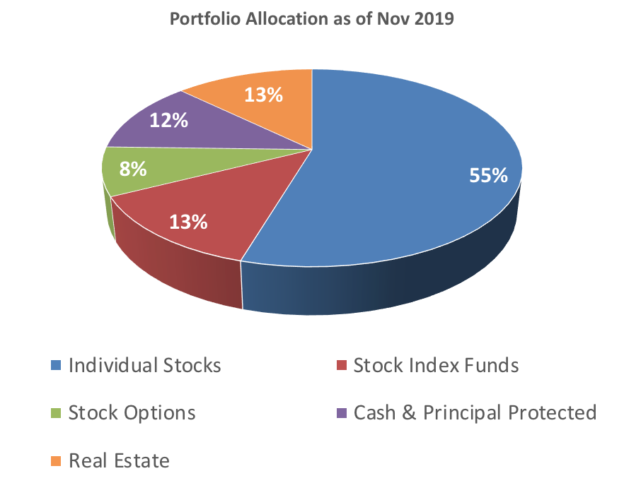
See this link for the 2017 allocations. First thing to notice from the pie chart is how my individual stocks have grown to become a much larger piece of the pie (nearly doubled from 28% in 2017 to 55%). There were two factors influencing this: One, some of my individual stock positions have beaten the market substantially (I discuss individual stocks in more detail later). Second, I have gradually reduced my index fund holdings and bought more individual securities.
As I wrote in that Nov 2017 blog post, I had been doing this gradual money transfer for a few years now. As I identify a good individual business to own for the long term, I reduce my index fund position and buy that stock. My overall market risk does not change except that I take some incremental company-specific risk (idiosyncratic risk) in owning individual stocks. As I wrote in more details here, I prefer to gradually build my stock positions over time.
So, this combination of reducing index funds and growing stock positions have resulted in stocks’ taking a dominant share of the pie. Combined, my stock holdings and index funds today amounts to 68% of my portfolio—from 56% two years ago. The individual positions are now a much bigger part and yet I feel comfortable owning all my stocks. I have studied these businesses in depth, and I have faith in their long-term prospects.
Near term gyration of the stock market will undoubtedly affect my stock positions but that is the price of admission to long-term investing. See this: Am I prepared for stock market winter?
What do I own in individual stocks? Here’s the table in the same format as the one from 2017.
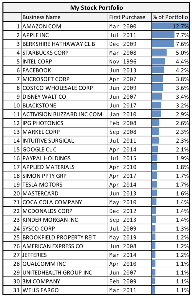
Today, I have 30+ individual positions—about the same as in 2017. Though in two years, the list has grown top heavy. The top 8 positions now make up about half of the total. This isn’t surprising given how large cap and high-tech public companies have rallied in the stock market. I am comfortable with this. I never sell a position for the sake of rebalancing in my individual stocks’ holdings.
This list doesn’t look too different from where it was in 2017. Positions have moved in rankings mainly due to their relative performances. The following table shows my purchases since 2017.
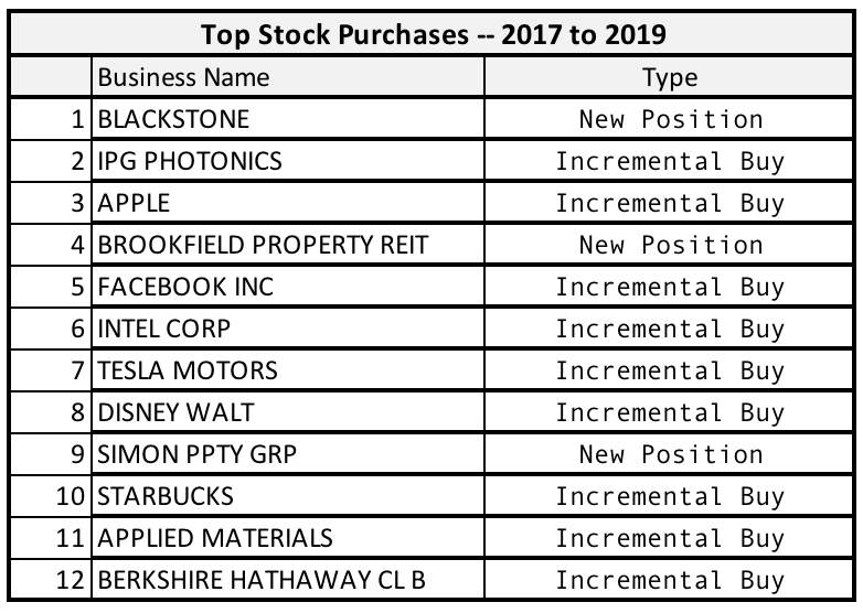
The table is rank ordered based on dollar amounts that went into buying a position. Three new stocks that I had only started buying in last two years were Blackstone, Simon, and Brookfield REIT. You can check my detailed investment theses on them here, here, and here.
Other stocks on that list are familiar names. I have written about them multiple times in past two years. I like them all, plan to keep them, and add to my stakes whenever their share prices drop to some reasonable level. For reference, check my thoughts on each of these positions here: IPG Photonics, Apple, Facebook, Intel, Tesla, Disney, Berkshire.
Note that Brookfield and Simon are both REITs (Real Estate Investment Trusts). Their main business is commercial real-estate operation. Even though I show them here in my individual stocks’ list, I include them in real-estate holdings when considering my overall allocation—as in the previous pie chart.
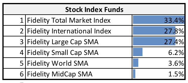
Stock Index Funds. Even though my holdings in index funds have shrunk to 13% today (from 28% in 2017), they are still substantial part of my portfolio. These are the index funds I currently hold. There is not much to say about them. I try to pick funds with lowest expense ratios and those that cover broad market indexes. I am limited though by the funds made available by my fund custodians. Some of this money is in a deferred compensation plan with a previous employer where I am restricted in what I could own.
Next up are Stock Options. For background on these, see my explanation from the 2017 blog post here.
Today, they are slightly smaller fraction of my portfolio than they were in 2017 (8% from 11%). But that is mostly a consequence of my keeping them pegged to a fixed dollar amount while the rest of the portfolio has continued growing. I use stock options to generate income over and above the regular dividends. My downside risk is the same as in holding stocks. I trade my upside capital gains with options’ time values. Most of this money is invested is invested in covered calls.
Between the options, stocks, and stock funds, I have three-quarter of my portfolio. Combined, they fall in high-growth unprotected category. Why unprotected? Because they don’t have any downside protections. These investments mostly move up and down with the stock market. In the long run though, I expect them to do better than the market. I pick long-term durable growing businesses that should do well in up-markets, and also hold their own in down-markets.
This leads to my principal protected investments. Cash and certain other structured positions constitute these. I have about 12% of my portfolio invested in them. The goal here is twofold: First, I don’t want them to drop in value below my cost. And secondly, they are liquid positions where I could readily sell them when I need to.

So, how do I keep my principal protected? I keep a portion of it in cash which makes it both highly liquid and safe. This is where I go for my near-term expenses—what I might need to draw upon in the next twelve months.
Today, cash is about one-third of my protected investments. The rest is split between cash-like investments where I park my dry powder and defined-outcome positions. I take controlled market risk here.
I’d written about my dry powder strategy in past blogs posts. See these two posts: I use cash as dry powder, Investing amid volatility. As I explained in those posts, this dry powder cash only gets deployed when the stock market goes down. And even then, in a controlled and gradual manner. When this cash is not invested in stocks, I invest it in protective collars that could result in 3% to 5% annualized returns. The principal stay protected from the market’s downside. These positions last for anywhere between six months to two years. I ladder them so they mature every three to six months.
Defined-outcome investments are also similar in structure—they are protective collars. Key difference here is that I take some downside risk with these. When shares underlying a protective collar go down in value, I could lose a fraction of my principal—usually 1% to 2%. Tradeoff though is potentially much higher returns if the shares rally. See the last month’s post on my Apple collar where expected return range is from 1.4% loss to up to 9.8% gain.
One category absent from my current portfolio is bonds. I had some in 2017 but since then I have sold them off. I did an analysis of Yale’s endowment portfolio allocations last year (Benchmarking my portfolio against Yale’s endowment). In that post, I pointed out that David Swensen, Yale’s chief investor, doesn’t think bonds do much to a portfolio other than as a hedge against unexpected deflation. Motivated by Swensen’s approach, I have also gotten rid of bonds from my portfolio—choosing to replace them with defined-outcome investing.
And last but not the least are my real estate positions. These have grown over the last two years—mainly due to my buying commercial real estate (REIT) stocks. I wrote about them in a September post: A quick look at my real assets portfolio. In there, you can see what I had bought recently and why. I won’t repeat those details here.
Leave a Reply